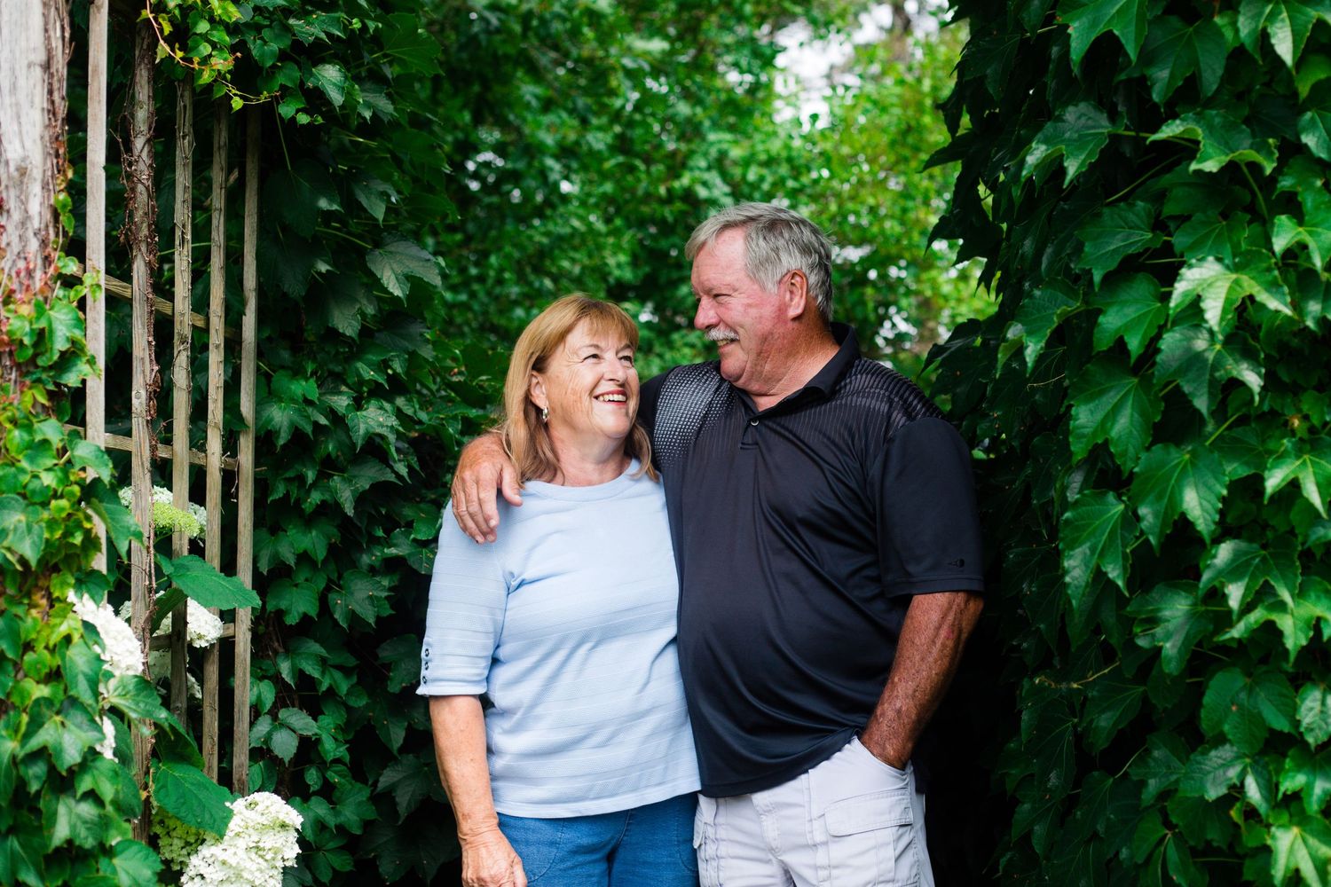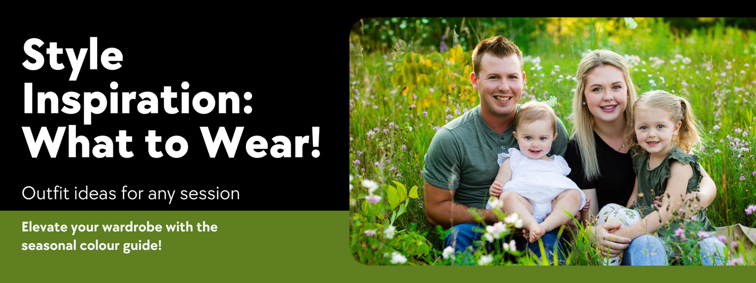
TIPS FOR STYLING AND COLOUR COORDINATING
CHOOSE A THEME
Decide on a theme or mood for your photo session. Whether it's casual or formal, having a theme in mind will guide your styling choices.
COORDINATE - DON'T MATCH
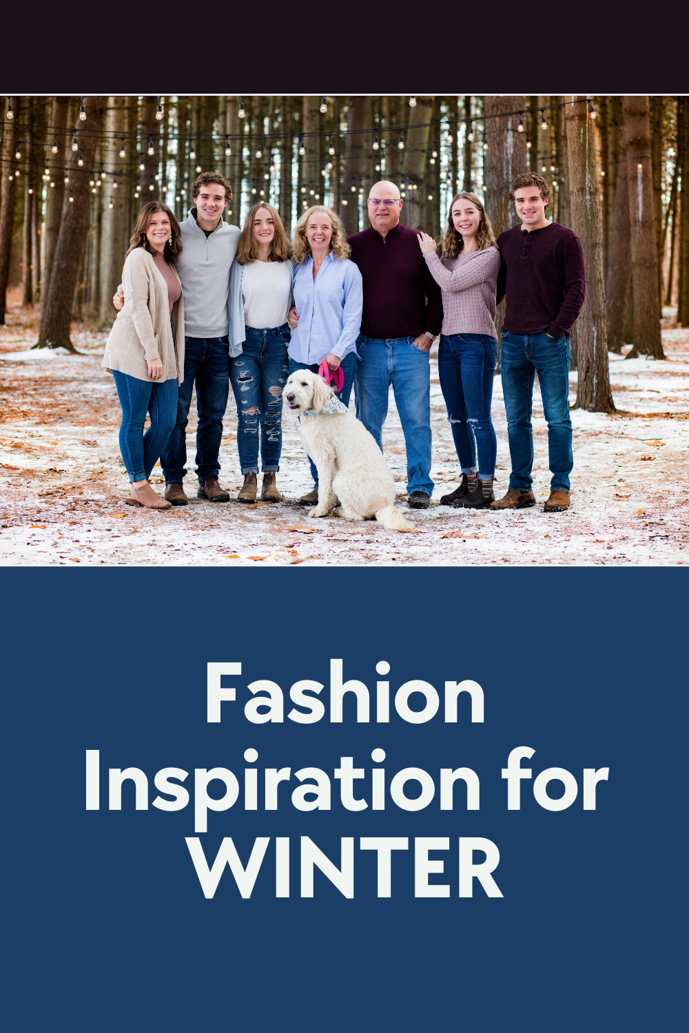
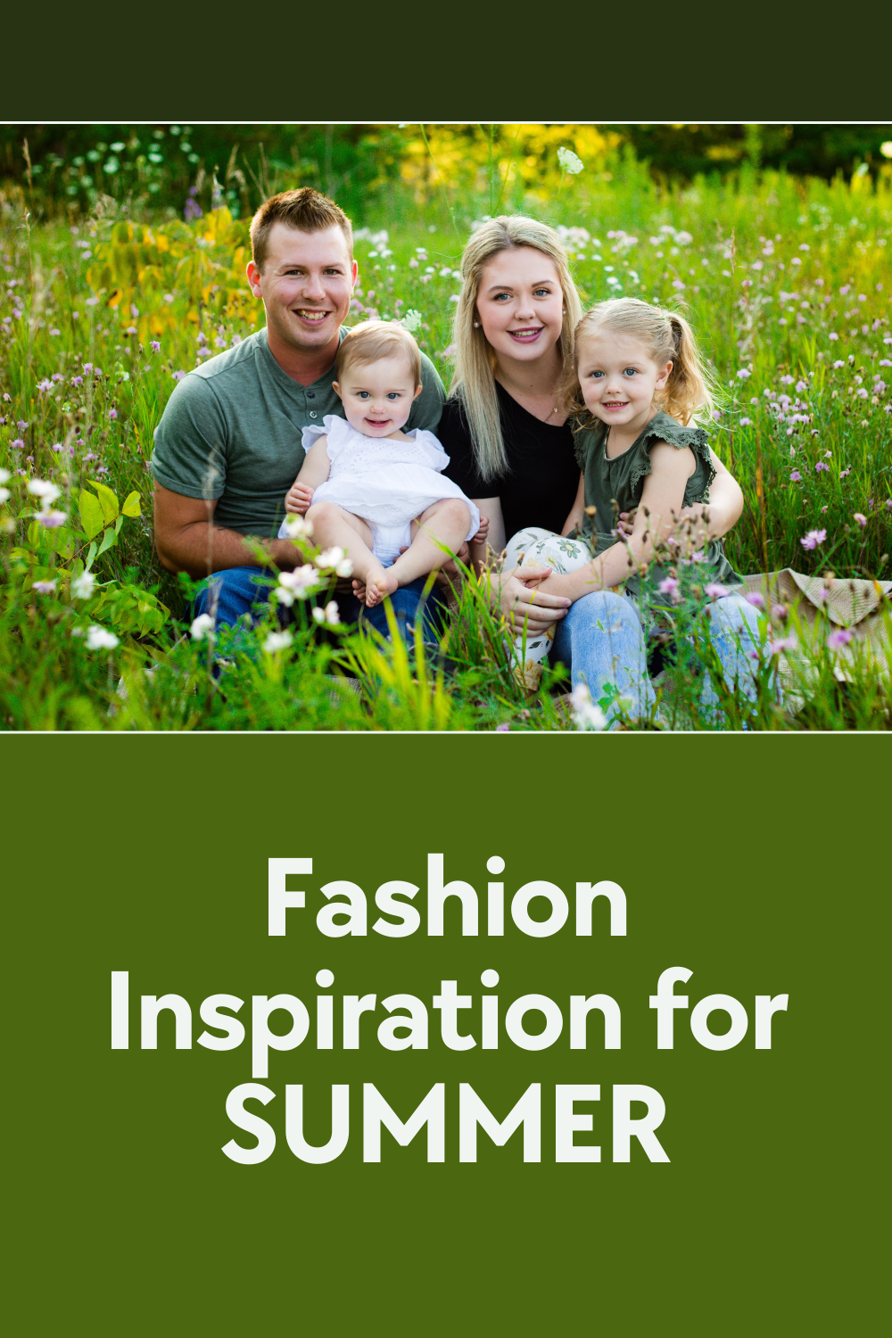
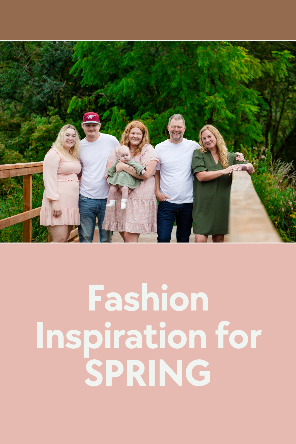
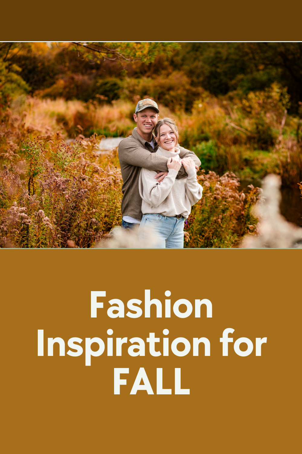
Instead of everyone wearing the exact same colour, aim for coordination. Select a color palette of 2-4 complementary colors and distribute them among the outfits. This creates visual interest without looking too uniform.
CONSIDER THE SETTING
Think about where the photoshoot will take place. If it's outdoors, consider how the natural surroundings will blend with your chosen colors. For indoor shoots, consider the colours of the walls or furniture.
AVOID BUSY PATTERNS
Busy patterns can be distracting and may clash with other elements in the photo. Opt for solid colors or subtle patterns that complement each other.
LAYERING AND TEXTURES
Incorporating layers and textures adds depth to your photos. Mix fabrics like cotton, denim, lace, or satin for a visually appealing result.
BE YOURSELF
Ultimately, the most important thing is to feel comfortable and confident in what you're wearing. Choose outfits that reflect your personality and style, and don't be afraid to let your individuality shine through.
SEASONAL INSPIRATION
Take cues from the season for your color palette. For example, pastel shades and floral prints work well for spring, while warm, earthy tones are perfect for fall. Let the natural colors of the season influence your styling choices.
ACCESSORIZE WISELY
Accessories can tie the whole look together. Choose accessories that compliment the color palette and style of the outfits without overpowering them.
CONSIDER THE PURPOSE
Think about the purpose of the photoshoot and the intended audience. Are you aiming for a professional headshot, a family portrait, or a fun engagement shoot? Tailor the styling and color scheme accordingly to suit the context and audience.
CLICK ON THE LINKS BELOW TO FIND THE PERFECT COLOUR MATCH